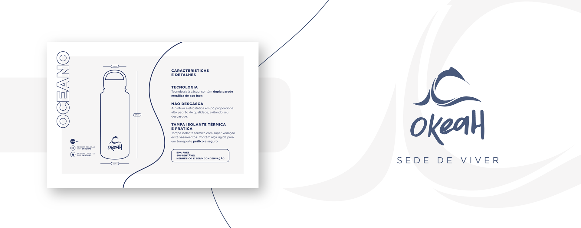

Okeah
Client: Gabriel Ralin
Okeah is a Russian word that translates to Ocean. The company is focused on reusable bottles and sustainable practices that bring solutions for preserving life.
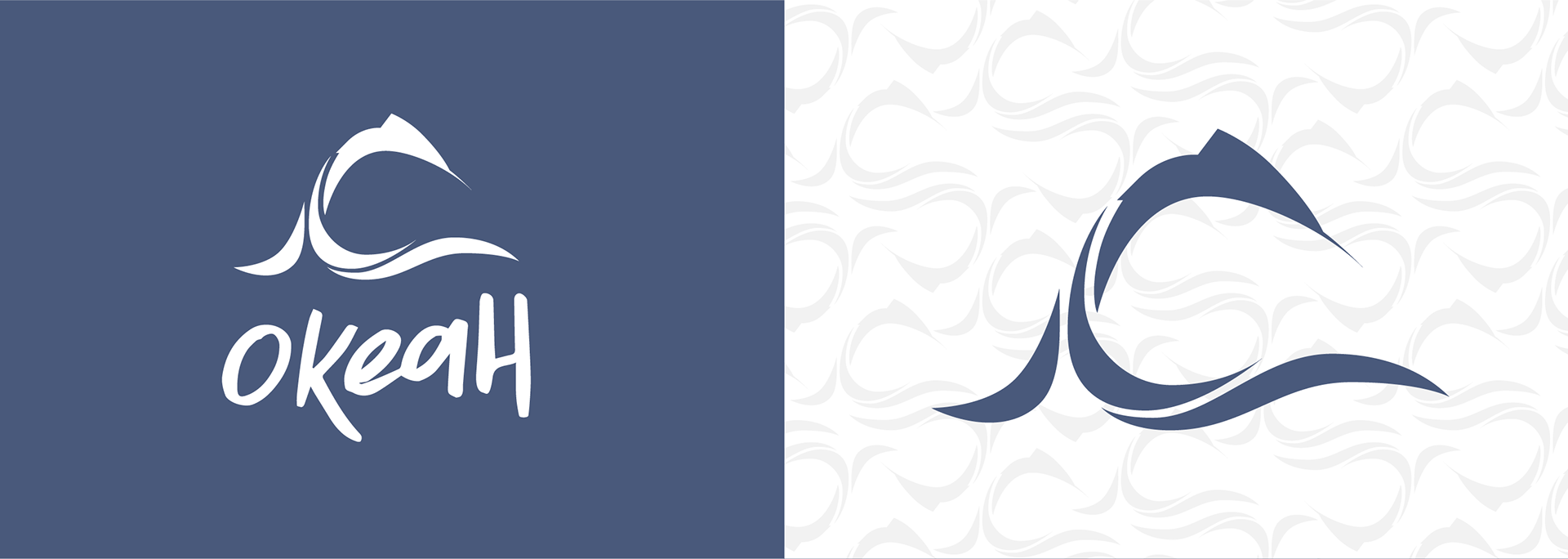
To show a connection to the ocean, one of the brand's main worries, a dolphin was chosen to be based on the design of the logo, and by connecting it to the waves, it brings the main identity of the brand. The logo also needed to be approachable and young, guiding the choice of a handwritten logo.